PowerApps functions
Parse text to number
Filter('Workflow Tasks'; ID = Value(txtId.Text))
Add datas (listItem)
Patch(NewVoie;Defaults(NewVoie);{Num_x00e9_rovoie:"0"&LookUp(NewVoie;ID=1).Num_x00e9_rovoie}))
Update context, and forms datas
SubmitForm(FormBeneficiaires);;ResetForm(FormBeneficiaires);; NewForm(FormBeneficiaires);; UpdateContext({showPopup:false});
If(IsBlankOrError(SubmitForm(Form1)), Set(saveStatus, "An error occured" & Form1.Error), Set(saveStatus, "Operation succeded"))
Navigate to another form
Navigate(Page_infos_enregistrements)
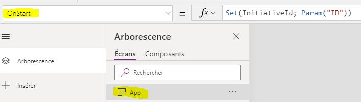
Get query string parameter and set a variable
Set(InitiativeId; Param("ID"))
Get a field from your datasource by ID
First(Filter(Initiatives; ID=1)).Nom
And Or Not
Or(And(Radio1.Selected.Value=4; !IsBlank(txtComment.Text));Radio1.Selected.Value<4)
Update Lookup Field
Patch(
        ResultatAnalyses;
        First(//here item to update
            Filter(
                ResultatAnalyses;
                Affaire.Id = currentAffaire.ID And Analyse.Id = ThisItem.ID
            )
        );
        {
            Title: "notused";
            Commentaires: txtGalComment.Text;
            Gravite: Rating1.Value;
            Affaire: {//lookup field name
                Id: currentAffaire.ID;//id of lookup
                Value: LookUp(
                    Affaires;//list who contains lookup value
                    ID = currentAffaire.ID;//id of lookup
                    currentAffaire.Title//title of lookup value
                )
            }
        }
    )
Patch Choice
TypeIntervention: {Value: dtvTypeIntervention.Selected.Value}
Execute automate with json
'My workflow'.Run(
	JSON(
		{
			SolutionId: selectedSolution.ID,
			ImageContent: UploadedImage14.Image
		},
		JSONFormat.IncludeBinaryData
	)
);
Reg ex to get cleaned string
Clear(AttachmentsCollection);
ForAll(
      RenameColumns(DataCardValue91.Attachments, "Name", "Name1"),
      Collect(
             AttachmentsCollection,
             Name1
      )
);Set(Title1, First(AttachmentsCollection).Value);Set(FileName1, Concat( Split(First(AttachmentsCollection).Value, "" ), If( IsMatch(Result, "([^A-Za-z0-9\.\-])" ), "",Result ) ))
Save Form
SubmitForm(Form1);;If(!IsBlankOrError( Form1.Error); Notify("Une erreur est survenue lors de la sauvegarde " & Form1.Error; NotificationType.Error);Notify("La savegarde a réussi";NotificationType.Information);;Set(currentElement; Form1.LastSubmit))
Sort columns
Set(Month, Distinct(SortByColumns(CurrentMonthMails, "Year", Ascending, "Month", Ascending), Month))
Set date
Set(StartDate, DateAdd(DateTimeValue( Day(Today) &"/"& Month(Today) &"/"& Year(Today) &" 00:00:00"), -30));
Sum
Sum(Filter(CurrentMonthMails, Month = ThisItem.Result ), uniqMails)